Background
BOLD acquired Monster.com in 2025. On Monster, there are 3 different apply types:
1. Manual apply
2. One-click apply
3. AI-assisted autofill apply (the focus of this case study!)
How it works: Our system fills in applications and uses AI to draft answers to open-ended questions, which takes 30 seconds to a minute. Users review before sending.
Business goals
Of the automated apply types (one-click apply and autofill), autofill accounts for 90% of them. The more autofill applications users submit, the more money we make.
User needs
Filling out application forms over and over again is time-consuming and exhausting. Allowing applicants to enter their details once so we can fill out application forms lets them apply to more jobs faster, saving them time and effort.
Competitive analysis and naming brainstorm
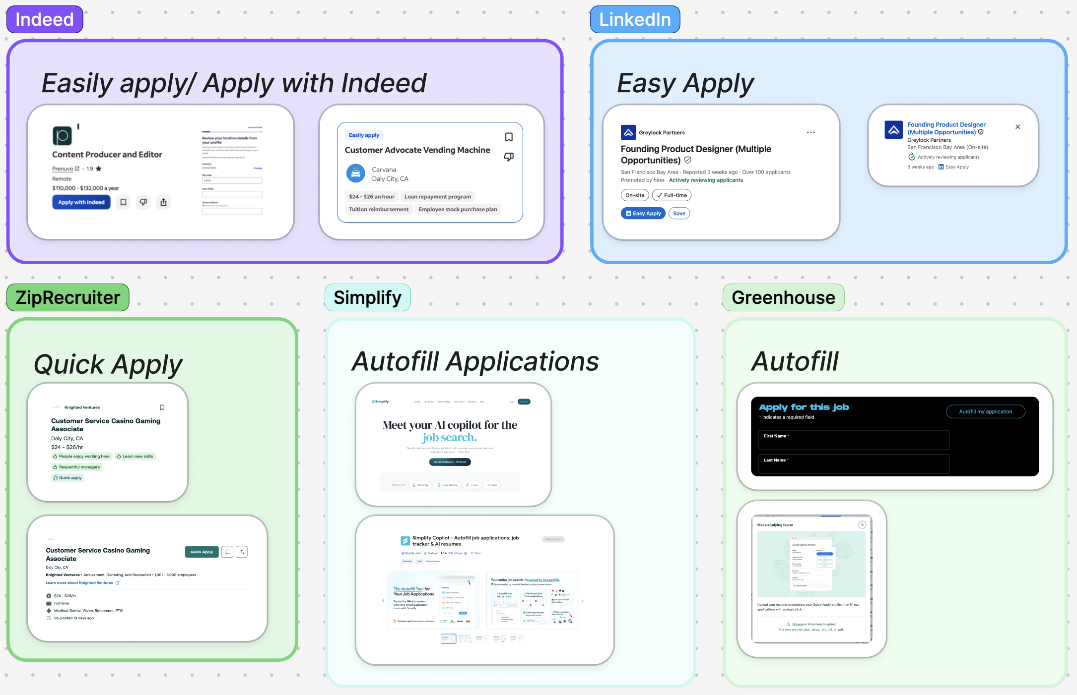
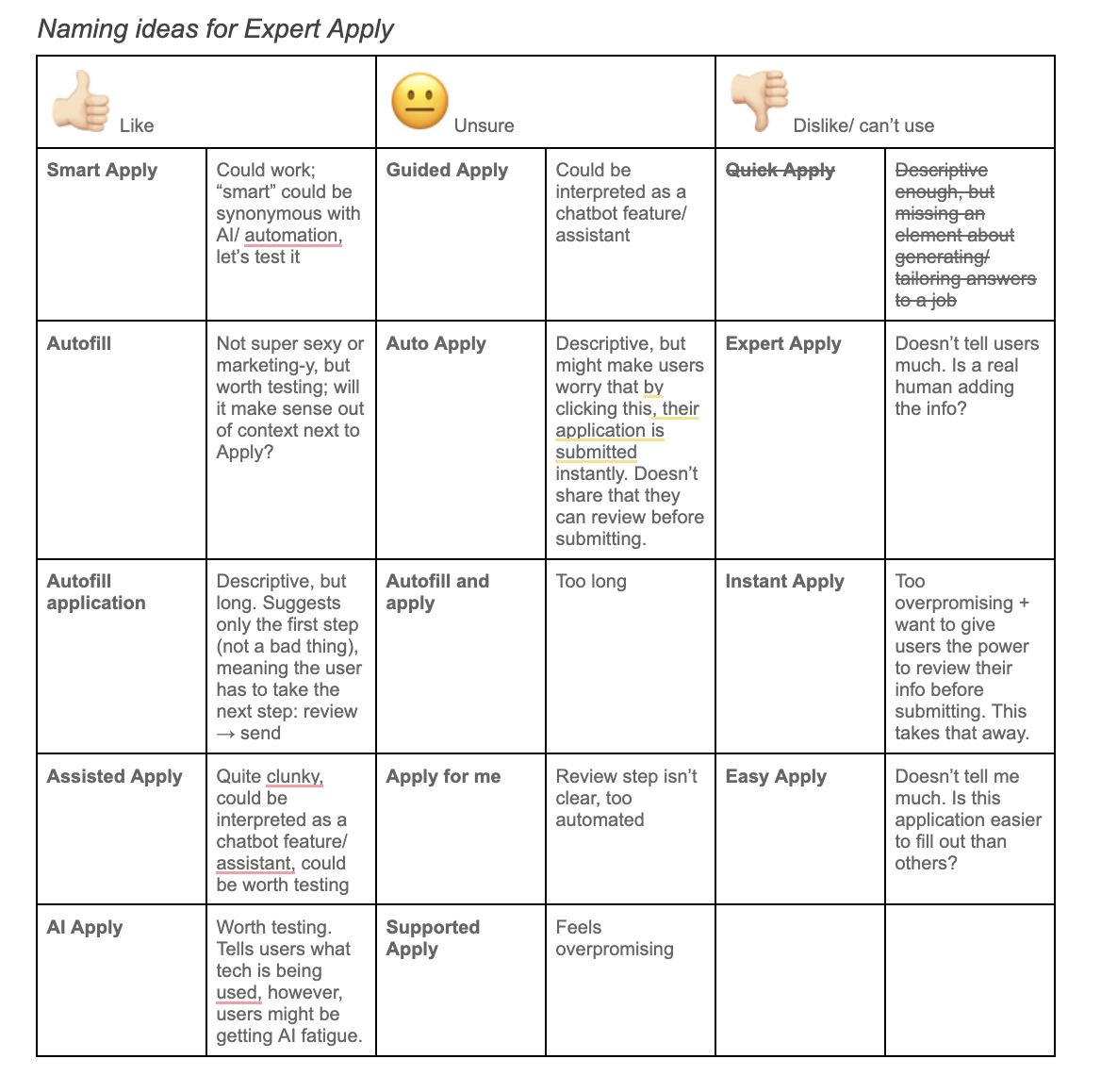
I looked at how other job sites label their quick apply options and came up with ideas for us to test among users.
User research
I collaborated with our User Researcher on designing a user research study to test the different feature name options. I proposed Autofill. Executive stakeholders pushed for Smart Apply and AI Apply.
Users generally understood the purpose of the feature, noting exciting around being able to autofill forms. AI Apply made people think the feature would come up with answers that weren't accurate, and caused anxiety that they wouldn't be able to review the answers before sending.
My naming recommendation: Autofill and review
Rationale: Users are generally familiar with the autofill mechanism and are reassured by knowing they can review their application before sending.
Wireframing
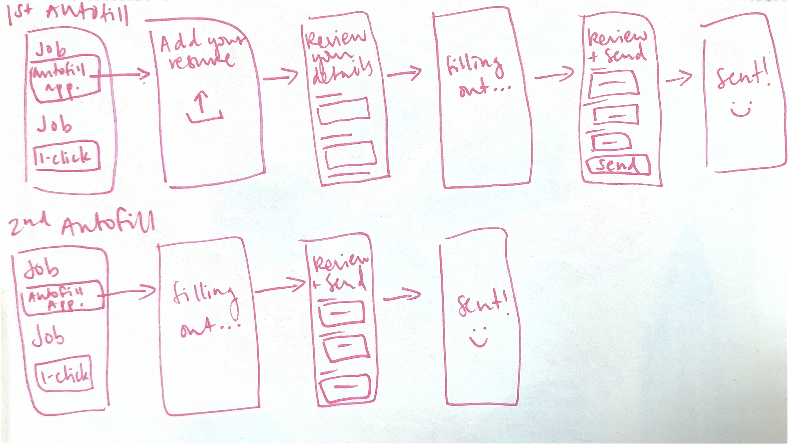
I sketched up a flow to help me get started on content design.
Ideating
I worked in Figma in parallel with the Product Designer, collaborating on entry points, different user journeys, and edge cases.
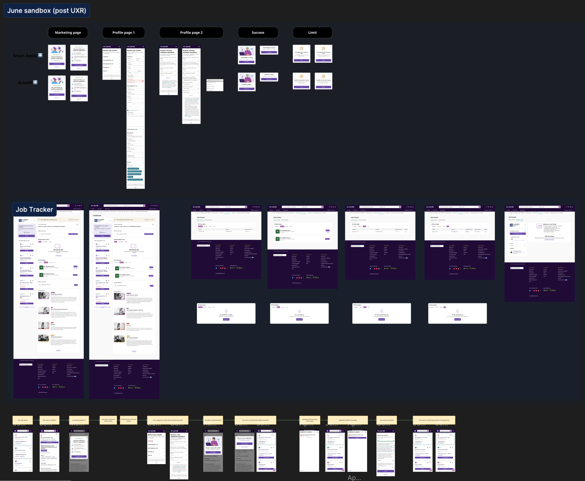
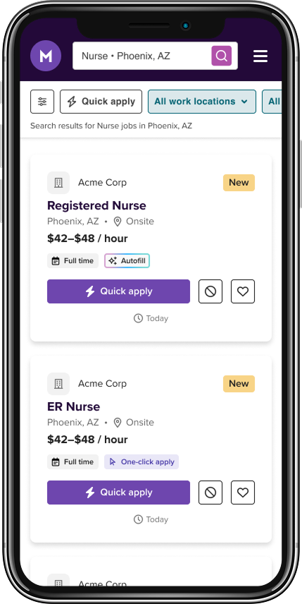
I explored different options of where we surfaced the feature name: the primary CTA, a badge on each job listing, or both, along with other entry points like application-type filters and the job tracker.
I brainstormed copy directions in annotations, then brought my top choices to the broader team of designers and PMs for feedback.
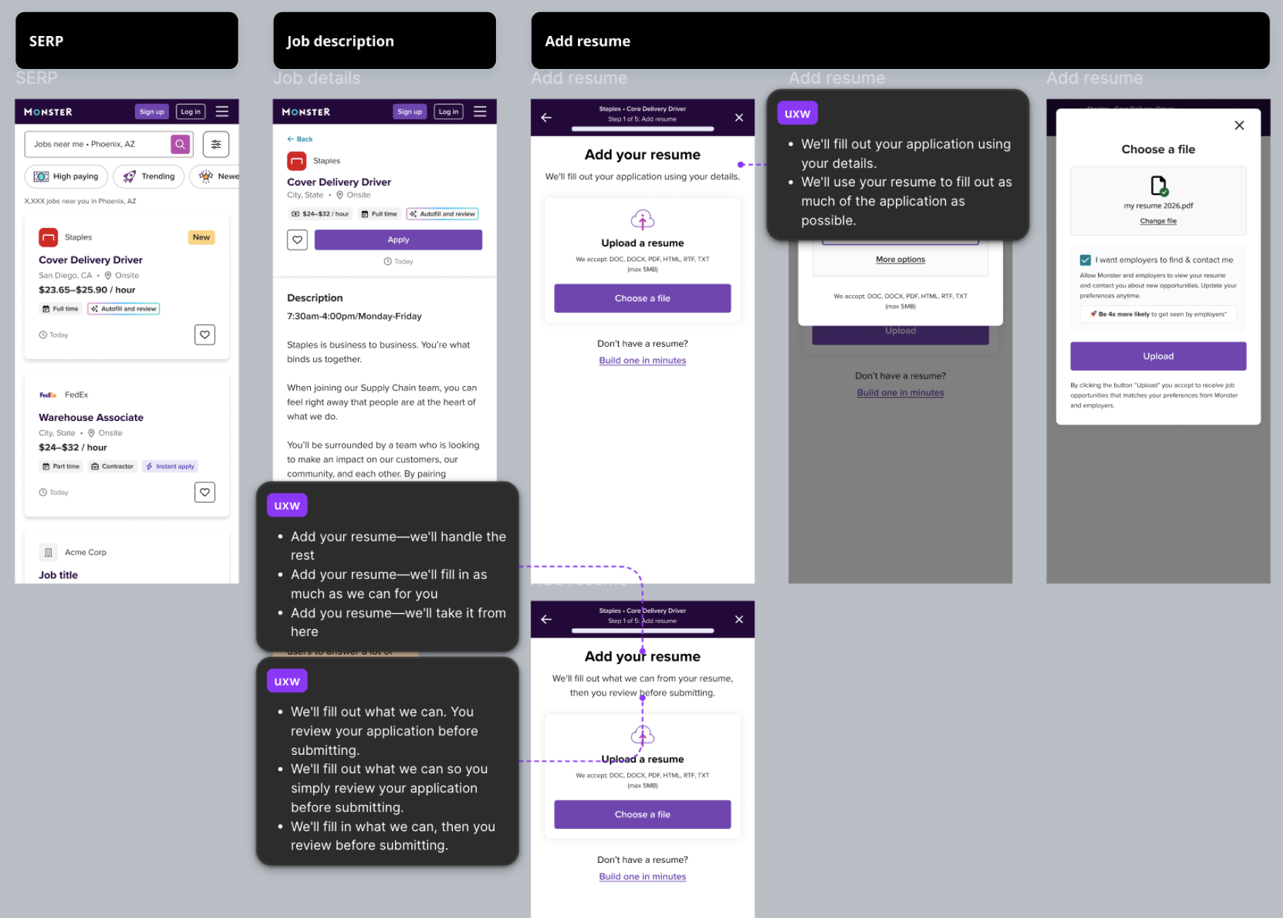
Iterating on the name
Having both the feature name in the CTA and as a badge created a lot of cognitive overload, especially if a job feed included autofill jobs, one-click apply jobs, and manual apply jobs.Screenshot of Figma
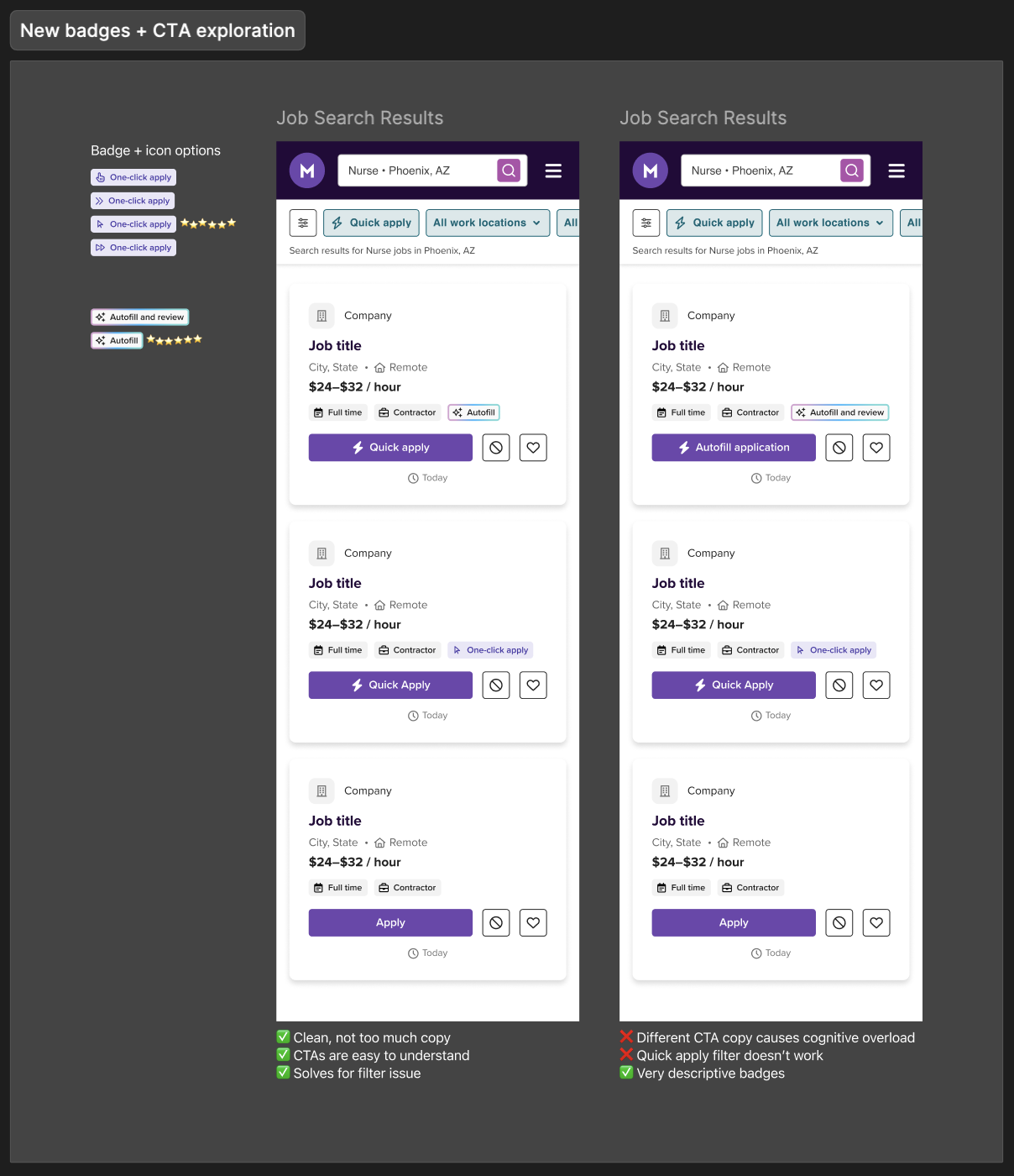
I proposed using quick apply for both autofill and one-click apply job CTAs to reduce cognitive load and align with the mental model that competitors already established. Badges on each job would indicate the apply type.
For brevity and to reduce text on an already text-heavy screen, I proposed changing the badges to simply autofill and one-click apply. I worked with my designer on icons that would add visual language and description to the badges.
This also solved for a legacy filter label quick apply (which filtered autofill and one-click apply jobs) that engineering did not have capacity to change during this project.
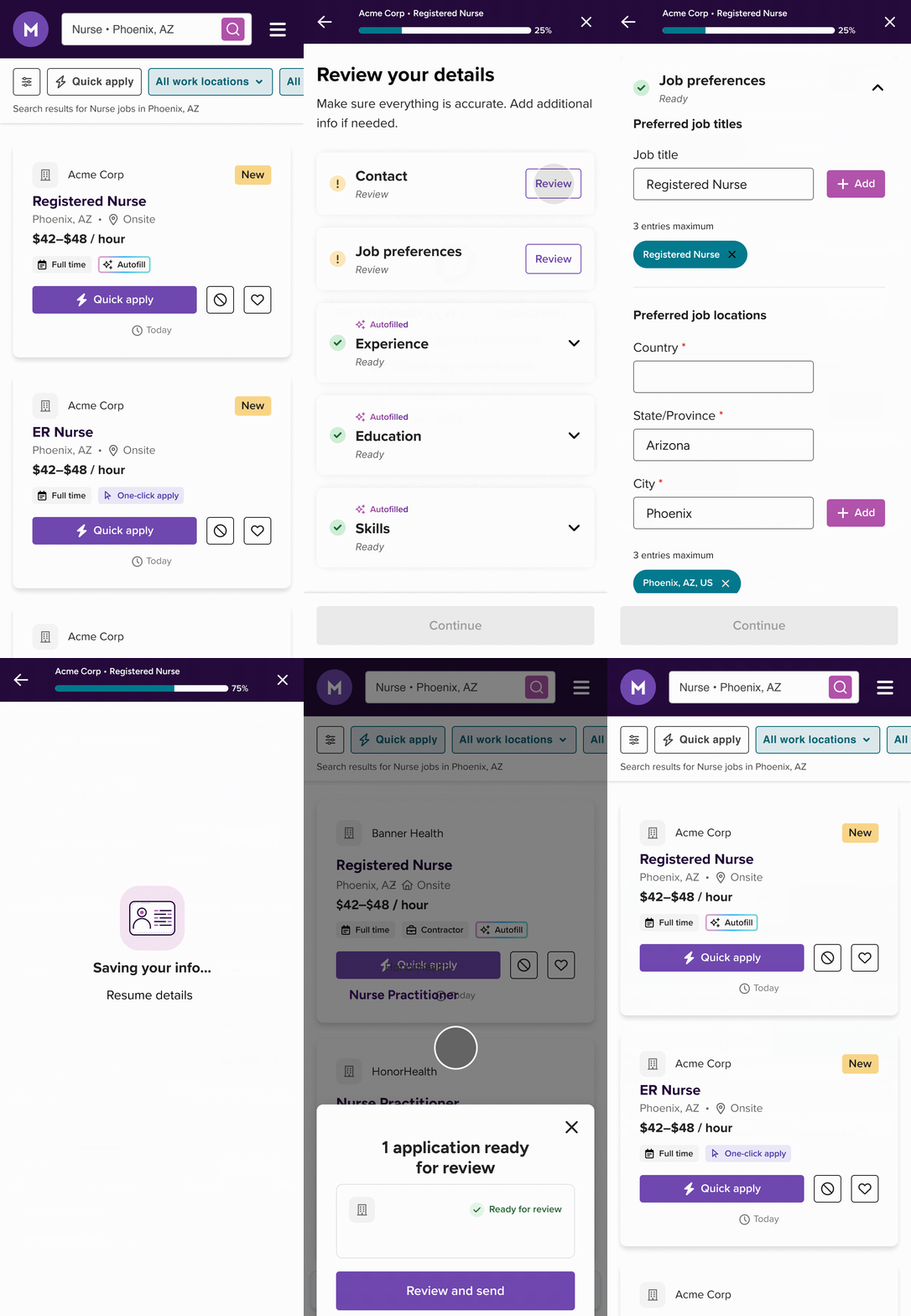
Final flow
Results
We launched a feature satisfaction survey in August on Monster. 96% of respondents rated the feature as positive, 3% rated it as neutral, and 1% rated the feature as negative. 34% of free-text comments related to ease and simplicity of feature, and 22% noted speed and time saved.
Autofill increased conversion by 2% over the course of 6 weeks.
Full case study available on request.